2 Months
Academic Project
Prototype
Professionals with urgent, specific questions face a frustrating gap in the market. Mentra bridges that gap: a marketplace where professionals book 15–60 minute paid consultations with AI suggested specialists, get AI-assisted guidance throughout, and leave with actionable next steps.
My role: responsible for all UX research synthesis, creative strategy, interaction design, and design system documentation.
1. Define the Task Flow: Three AI moments were identified as the highest-leverage design opportunities
AI-powered specialist matching: users describe their situation and the system surfaces the best-fit specialists with an explanation: knowing who to trust.
AI note-taking during the session: the platform captures key points and action items, so users can focus on the conversation.
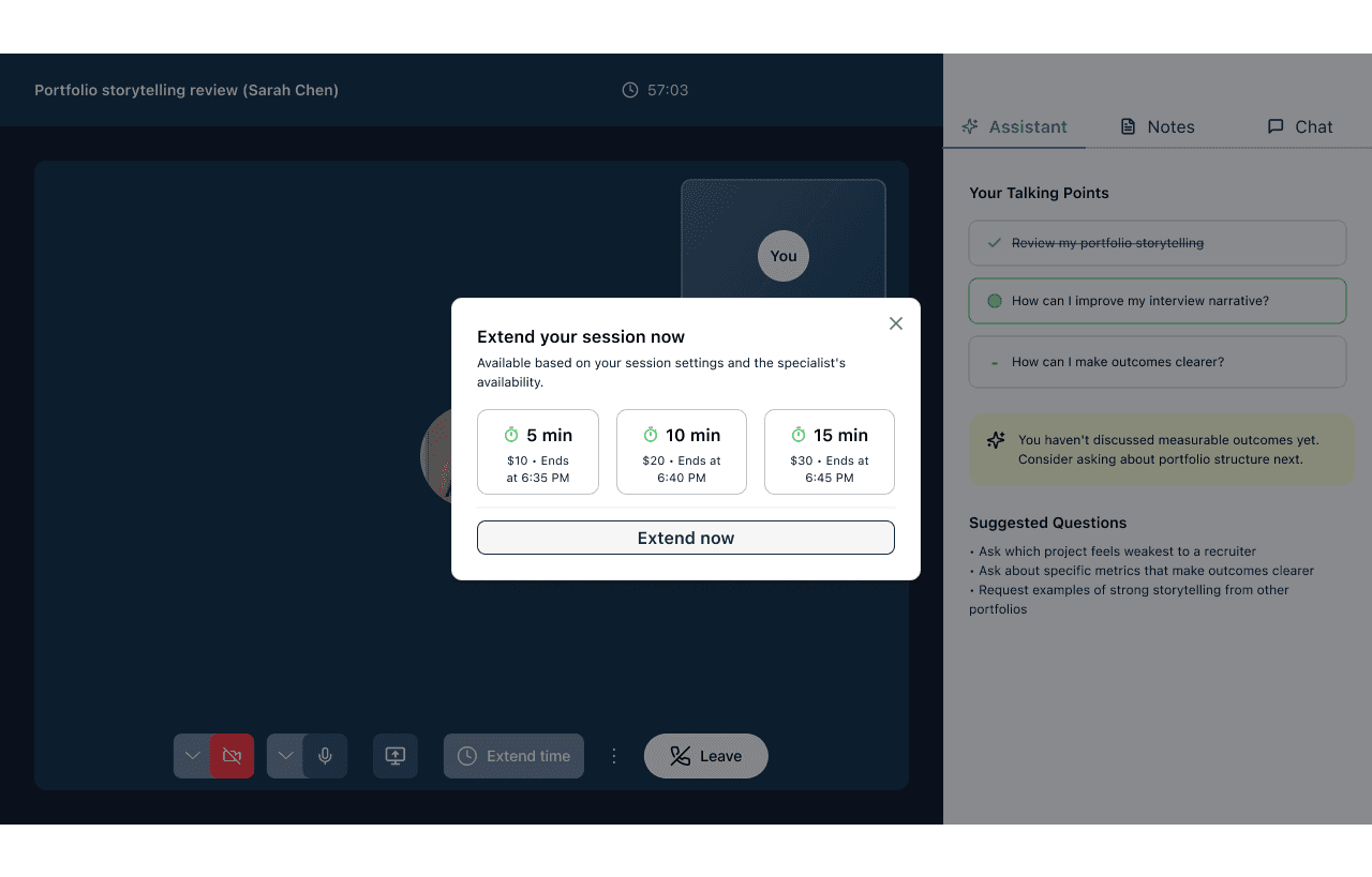
AI-powered smart session extension: at five minutes remaining, the system proactively notify an extension option with the specialist's live availability. The user decides with full information.

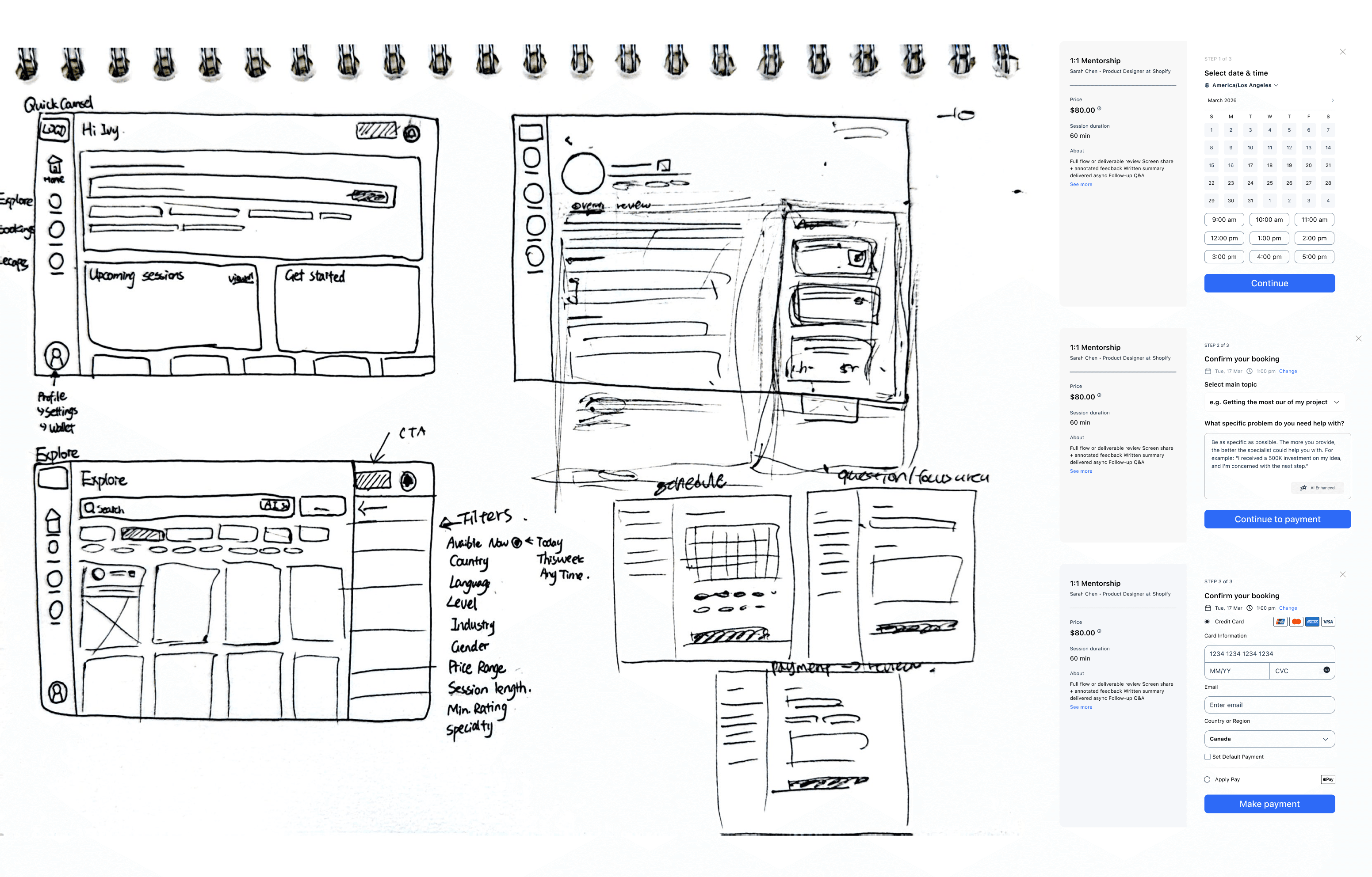
2. Sketch: the goal was to test the navigation logic on paper
The home screen needed to serve two states: a user with no sessions yet (onboarding/discovery mode) and a returning user (continuation mode).
The explore page filter system was sketched with multiple filter dimensions, narrowing to the five that tested as most decision-relevant happened in wireframing.
The booking flow was sketched as three separate screens (schedule, question/focus area & payment).
Five usability testings revealed structural frictions for design iterations:
01 Home screen: the entry point sets the platform's core proposition in one search bar; the suggested prompts model the behaviour the platform needs: articulating a specific question.

02 Explore with filter: category tabs handle broad navigation; the filter panel handles precision. The open filter state was a deliberate "All Filter" label.

03 Specialist profile: the "Why Match?" panel answers the question: "Why is this the right one for me?" Over 89% five-star reviews and industry-specific experience have surfaced as match rationale.

04 Session preparation: talking points define the agenda, and the AI "Generate suggestions" prompt helps users who aren't sure how to articulate what they need

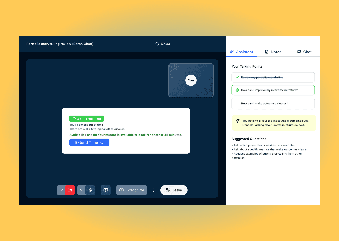
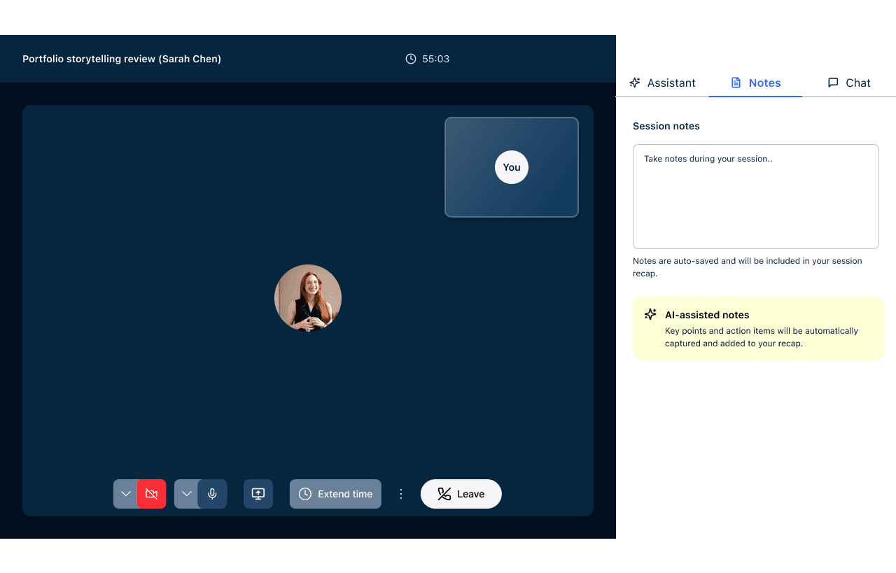
05 In-call notes: the right panel during the session offers three modes: Assistant, Notes, and Chat, so users can choose how actively they engage with AI support. The AI-assisted notes card in the Notes tab communicates the key value proposition: key points and action items.
06 The passive timer is a proactive session manager: presents three time increment options with real-time pricing and end times, triggered proactively at five minutes remaining.
Evidence from usability testing: "Time notification could be more prompting and visible"
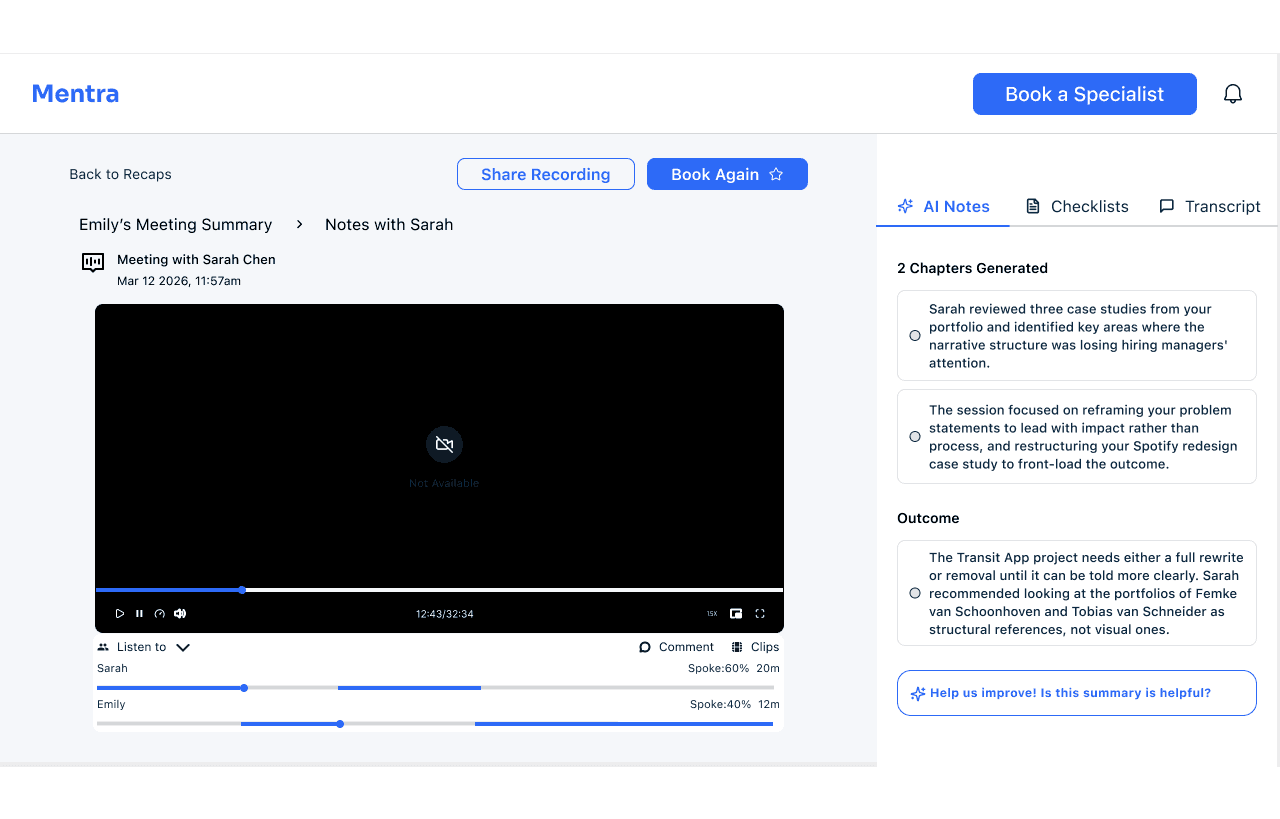
07 The static recap: AI chapters that do the reading for you. Post-session, the AI Notes panel organises the session into chapters and outcomes rather than a raw transcript.
The design system was built to be a working constraint; every component on every screen is connected to it.
Semantic colour roles. Every colour has a specific, single meaning across the entire product. Blue is navigation and primary actions. Green signals success, confirmation, and AI features. Yellow stands for AI, making the platform's intelligence layer immediately recognisable and transparently labeled.
Accessibility-first colour documentation.Every colour combination appearing in the UI was tested against WCAG 2.1 using the Colour Contrast Analysis

Building an AI-assisted marketplace prototype taught me that the hardest design problems aren't about what's visible on screen; they're about what the user never finds. The preparation screen discoverability failure, the AI recommendation that didn't explain itself, the timer that no one noticed: all of these were features that existed but failed to do their job because of hierarchy, placement, and affordance decisions that looked fine in isolation.